00:00
00:00
trixelbit

31 Art Reviews

12 w/ Responses

Low Key was hoping it was animated >:

Regardless, you have the pose and lighting pretty well defined on the body!

Her blade fidget spinner is a bit questionable. I think if you want to sell that it's metal, you should add white strikes of light across the metal and make the dark tones darker.

The Anti-Aliasing is also a bit wonkey on the bladed but aside from that, Good stuff!


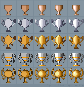
metal reference: https://orig00.deviantart.net/77ab/f/2015/235/1/f/tutorial__how_to_draw_trophies_by_oni1ink-d96u62k.png

gatekid3 responds:

i based the shading off of the actual painwheel game art, so it came out a bit duller, there are highlights on the metal though.i dont think the dark tones need to be any darker, but there were some things i could have done to make it more reflective that i didnt do.

And nah, didnt feel like animating this, too many twitchy, moving parts.

Awesome job! Really love the color choices and lighting/shading! Not the mention the line work. Definitly taking some notes over here.

Love the color composition! The different hues used in the shading make the lighting seem interesting. Good stuff!

Impressive technicality dude! The shading and texturing is on point! There is some parts ( like the upper left Bicep) where the anatomy seems a bit off. The triceps/biceps on the left arm are bigger than the shoulder while its isn't on the other side. I also suggest using darker tones to create greater contrast. The torso kinda blends with left arm so greater contrast could make the parts easily discernible at a glance. All in all tho, Great stuff! I'd love to see what else you could do with your technicality!

VeronikaSurovcov responds:

Hi TriXeL! Thank you. I find your constructive criticism very helpful. I am aware that the anatomy is off here and there, that's why I'm drawing these - in hope that I'll figure it out in the process :) I have always struggled with getting it right. Mostly I just enjoy it, though. I find drawing with this technique quite relaxing. Hopefully, in the future it will even look realistic enough.

I want to like it but something about it ticks me off. Maybe something with the color composition or the style contrast between the minimalistic background and the higher detailed foreground . I don't like how the rocks are compact on the top half and drops down suddenly on the bottom, makes the composition of the ground feel not cohesive. Idk. I'm not a hater though; the pixel technicality is pretty good and I especially like the pattern used to shade the tree (a mix up from the usual dithering). Not bad, but not up to par with your other works (in my opinion). Can't wait to see what else you do!

ScepterDPinoy responds:

Aw thank you for the constructive feedback! I know this was rushed but even though It's not as good as any submission in my gallery I made I somewhat enjoyed making it. :)

If people dislike or hate my art and give less than 2 stars I don't flag their comments but alternatively I advise them to look elsewhere. It's their choice. I just make art for fun and not to seek attention. ;)

Texturing on the arm looks very spot on. Be aware of anatomy though. Specifically in the facial region. That's where the image get a bit wonky. Decent stuff regardless.

I like the gradation of the line and edges. The form of the figure doesn't seem completely natural, particularly in the feet. The staff seems a bit off in thickness and feels a bit awk. Besides that, this is pretty well done.

The smooth vector art in this doesn't bled well with the pixel figure. The central figure doesn't feel consistent. It comes of as chunky, lumpy and uneven. Shading is simplistic and plain. Dithering a method I like to use a lot. Gradating the edges with different shades is another option. Figuring out how you want to make shading your own takes a lot of experimentation. It took me forever to start getting mine. Hopefully this helps! Keep creating.

Even though the lines are drawn by you originally, this picture feels very superfluous and unoriginal from the perspective of the viewer. Try bringing new life to the image. Not rehash something players of the game have seen already. Also, add some more frames to the animation. It seems very choppy when fluid motion would fit it better. Stay determined though and keep creating!

LinkNiak responds:

haha thanks ;3

The animation seems interesting but feels void of a purpose. Really interesting though! If you drew the original picture as well, that show cases incredible realism.

MLScherbatov responds:

it's a photo of my friend, but i spent a while brushing over it to make it smoother, and the rest of that effect is from a gif optimizer. i agree that these pieces dont really have much direction at this point in time, but im hoping to make a more complex project soon where i'd start with drafts and create at least 200 frames, whereas this is like 30 that i made up as i went along. my first gifs were nothing but simple color changes or two frame animations, so this is all very new to me, and i could call these experiments in movement and line/shape more readily than finished pieces.
i've been considering getting a tablet so i can start doing more detailed digital painting with a stylus, so hopefully one day i can achieve that level of realism. thanks tho!

I make games, music, and pixel art!

Marco @trixelbit

Age 27, Male

Software Engineer 🖥️

University of Central Florida

Joined on 5/8/11

Level:
9
Exp Points:
852 / 900
Exp Rank:
82,355
Vote Power:
5.15 votes
Audio Scouts
2
Art Scouts
2
Rank:
Civilian
Global Rank:
79,995
Blams:
10
Saves:
68
B/P Bonus:
0%
Whistle:
Normal
Trophies:
4
Medals:
292
Supporter:
4y 1m 12d